Thursday, May 5, 2011
Wednesday, May 4, 2011
Tuesday, May 3, 2011
Evaluation, Question Four
How did you use new media technologies in the construction and research, planning and evaluation stages?
Due to the revolution of web 2.0 we were able to use the internet as a main source of research. During our research and planning stages, one of the media technologies we used was streaming site - YouTube. YouTube allowed us to view a broad range of real media texts, and get a feel for different styles and genres. It gave us a lot of inspiration and ideas toward the designing and making of our product. We gained a good idea of what our target audience liked/disliked from groups, channels, and comments that they were participating in and we began to visualise ideas for our video.Videos on YouTube that gave us inspiration to include stop motion animation within our product include:
Incomplete lullaby- Lisa Mitchell
Paralyzed – The Used
Amazon Kindle Commercial 1
Deerhunter – Famous last words
We felt that animation was so original and we were intrigued to learn the skills behind it. We used email to contact the creators of stop motion videos over the web, who in response gave us great advice and tips. We could also watch tutorial videos online that would teach us the essentials to animating.
Social networking sites 'myspace' and 'facebook' allowed us to research established bands or artists that were popular with our target audience. We could get an aiming point for the style, genre and image that our target audience like and what expectations they have from these artists. Social networking sites were really useful to us during researchOverall I would say that the internet played a huge main part in our planning and research stages and without it our research would be much more limited to resources such as television and magazines.
We used search engine; Google to search for promotional posters and CD covers across the net. This gave us easy access to existing media products in which we could carry out research for our ancillary task. We also used a scanner to scan in existing CD covers and posters that we had found that we wanted to transfer onto our Blogs. This was useful for comparing and analysing each one and carrying out further research.
During the construction of our video, we mainly used a video camera. This task was the first time I have ever used a video camera so my skills were basic, but developing every week. I learned how to use tools to create different effects with the camera, for example a tripod and dolly, or handheld camera movement. I learned how to frame a shot well and light a studio appropriately. For our animation scenes we used a still SLR pentax camera to take a number of frames that we could create into a video clip using iPhoto. I already have skills with a still camera from AS coursework, but doing stop motion animation has increased my knowledge and allowed me to solve problems. We used the still camera to take location shots, and carry out a photo shoot for our ancillary task.
Location Shots for Music Video
We were able to display our photoshoots in an attractive manor by using Adobe photoshop CS4 to create a contact sheet. This is advantageous because it displays all of the photos on one page in a fashionable and presentable way.
We used a mobile phone to play our track (1234) whilst we were filming the outside scenes to help us keep in time. This was very useful as the mobile phone was portable, had sufficient battery power and was loud enough for the camera to pick up the music over other unwanted sounds. We used a 'Nokia express Music' phone which is especially designed for playing music and suited our needs perfectly.
To edit our product, we used apple software; iMovie and Final cut express. Originally we put our raw footage into iMovie to create a basic sequence and order. When we wanted to really be picky and carry out detailed editing we used final cut express. Final cut allowed us to correct mistakes and solve problems we had made during filming due to it's very acurate precision editing. Websites such as 'dafont.com' allowed us to include graphics and interesting fonts of text within our anciallary tasks that would appeal to our audience.
The main new media technology that has benifitted our project is blogger. Blogger has allowed us to record our progress with dates and times, so we can present all of our work in one place and annotate it for our target audience to understand. We can upload videos, photos, links and tags using blogger, and even embed microsoft word, powerpoint or excel documents using websites such as Scribd.
Evaluation, Question Three
What have you learned from your audience feedback?
To gain audience feedback we used a number of methods:
1) Asking our audience to watch our video at a computer, and give us verbal feedback. This was useful because we could discuss with our audience the parts that had worked well and what they thought needed improving.
2) Creating a FaceBook page dedicated to our product, in which our audience had the ability to watch our video, comment, like and answer a set of questions we had asked. This was useful because alot of our target audience had easy access to facebook, it was quick for our audience to answer(ie. a few clicks of a button) and it was a sociable way to connect with our audience.
The development of Web 2.0 has been sincerely beneficial when gaining feedback from our audience.
We have posted a finished copy of our video to our youtube channel and facebook page in which our audience can comment and fill our our google docs questionnaire (connected through a link). This gave us very specific and detailed feedback.
Overall, the majority of feedback was very positive and complementary. The main positive things and were along the lines of:
-Very uplifting, cheery feel to the song. Highly enjoyable to watch.
-Stop motion scenes were original, fun, and were finished professionally.
-Nice use of mise en scene.
-Enjoyed the variety of shots and locations used (keeps audience interested and excited.)
People had told us things that we could improve on. They were along the lines of:
To gain audience feedback we used a number of methods:
1) Asking our audience to watch our video at a computer, and give us verbal feedback. This was useful because we could discuss with our audience the parts that had worked well and what they thought needed improving.
2) Creating a FaceBook page dedicated to our product, in which our audience had the ability to watch our video, comment, like and answer a set of questions we had asked. This was useful because alot of our target audience had easy access to facebook, it was quick for our audience to answer(ie. a few clicks of a button) and it was a sociable way to connect with our audience.
The questions and results can be viewed here
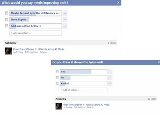
This is a screen shot of some of the questions we were asking via facebook:
and thirdly,
3) Using Google Docs to create a written questionnaire which would give us the feedback we needed. We made this questionnaire accessible online through Facebook, and promoted it as much as we could using private email, links, posts, and a dedicated facebook page for feedback.
This is a screen shot of some of the questions we were asking via facebook:

and thirdly,
3) Using Google Docs to create a written questionnaire which would give us the feedback we needed. We made this questionnaire accessible online through Facebook, and promoted it as much as we could using private email, links, posts, and a dedicated facebook page for feedback.
The development of Web 2.0 has been sincerely beneficial when gaining feedback from our audience.
We have posted a finished copy of our video to our youtube channel and facebook page in which our audience can comment and fill our our google docs questionnaire (connected through a link). This gave us very specific and detailed feedback.
Overall, the majority of feedback was very positive and complementary. The main positive things and were along the lines of:
-Very uplifting, cheery feel to the song. Highly enjoyable to watch.
-Stop motion scenes were original, fun, and were finished professionally.
-Nice use of mise en scene.
-Enjoyed the variety of shots and locations used (keeps audience interested and excited.)
People had told us things that we could improve on. They were along the lines of:
-Perhaps correct ''jumping'' from one shot to another at times so the video appears smoother
-A couple of places within the song, the stills could be more accurately synced in time with the beat
-Possibly include some more animation
We would have loved to include more animation scenes/make them longer however we found the stop motion very time consuming to film and edit, therefore the scenes were short but to a good standard. Because Final Cut express was new to us, it took us a while to develop the ability to overcome problems and edit successfully. Therefore next time we would use our broader knowledge of editing and would be able to solve some of the tiny syncing/jumping problems.
Evaluation, Question Two
How effective is the combination of your main product and ancillary texts?
I feel that the combination of our ancillary and main product work strongly as a pair, and that they compliment and enhance one another. We have tried to keep an established, recognizable and constant theme in a number of ways. Firstly, as the narrative of our main product was filmed outside we thought that we should repeat this through our ancillary products. The photographs on the album cover and poster are all located in the same place, starring shots of grass, trees and woodland, as shown in the video! We have made sure that our character (Sophia) is dressed and styled in a similar way during ancillary and video, therefore creating her an image that will appeal to the same audience in both products.
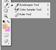
We have used a constant colour theme throughout both products. To do this we have used the 'eyedropper' tool on Adobe Photoshop cs4 which allows us to share the exact shades of colours between products.

Personally i would say that the video has less of a link to our poster and album cover, however in real media texts this is quite common. This is because our video is based on one song from an album. If all the songs had exactly the same theme it would become repetitive and boring. I think our album cover is sufficiently representative of our video.
Evaluation, Question One
In what ways does your media product use, develop or challenge forms and conventions of real media products?
Throughout the planning, research, construction and post production stages, we have constantly been aware of typical conventions and how we are going to meet/develop/challenge these conventions within our product.
During our ancillary task we challenged normal conventions by using a picture of an object (easle) on the front cover of our CD, as opose to the artist. This is different to the audience's usual expectations, making the cover seem striking and original.
Ancillary task's.
Audience Feedback (via Google Docs)
We have used Google Docs to create a questionnaire to help us recieve feedback. The Questionnaire is linked to facebook for maximum accessibility, and you can answer annonomously.
Audience Feedback (via Facebook)
To recieve feedback from our target audience we have used a number of methods.
Below is a questionnaire made on social networking site; Facebook, that has been filled out by our target audience. It has multiple choice answers and the option to add their own comment. This will help us to recieve useful information about improvemnt.
Media
Below is a questionnaire made on social networking site; Facebook, that has been filled out by our target audience. It has multiple choice answers and the option to add their own comment. This will help us to recieve useful information about improvemnt.
Media
Filming performance scene (2)
We got some feedback of our first draft video from our target audience. The main area for improvement was that the performance scene was becoming a little repetitive.
To solve this, Rhian and I decided we needed a second performance scene to break it up a little and make our video more interesting. We thought that this scene should be filmed outdoors to fit in with our natural theme and make a connection with the narrative scene.
We filmed our actress sat apon a tree, we filmed her from 4 or 5 different angles and used only the best two clips in our video to create a second performance scene. The shots were close up and framed so that sophia was the focus of the shot, but that so that you could tell she was outside(ie. you could see grass and trees ect.) We used a tripod because we had used alot of handheld camera clips in performance scene (1) and it would create more variation in the technology we were using. We followed our 'casual' theme by dressing sophia appropriately in casual clothes, scarf and coat to signify the continuos theme of autum months.
It was a cold day so i really liked the effect of her cold breath being visible in the video. The filming genreally went well and after a second audience feedback, they prefered the video with two performance scenes.
Filming performance scene (1)
Filming inside performance
Our performance scene was filmed in a studio against a black background. This was simple to do, easy to control the lighting and shadow, and of course conventional. During our first attempt at filming we tried to create a range of shots including; long shot, mid shot, a shot from the side and a close up. For each type of shot we would film our actress singing the song the whole way through with the camera fitted onto a tripod. However, when we came to view our footage it looked really unprofessional and boring because of the lack of camera movement, and the shot types we were using really didn’t work with our genre.
Therefore, we studied real media texts and analysed their performance scenes. One that really influenced us was Lisa Mitchell- Incomplete Lullaby (link to youtube). We noticed that only close ups of her face and shoulders were used – really limiting the variation in shots. However what made the performance scene so interesting to watch was the camera movement including; pans, tilts, handheld, and use of a dolly.
We re-filmed the performance scene, making sure we were strictly sticking to conventions. We used close up and extreme close up shots, ranging from high to low angles, and really focusing on the framing of our shots using all the camera movement possible, This outcome was much more satisfying as it met the conventions we were aiming for.
Filming narrative scene

Filming narrative scene
[scan in story board]
For our narrative scene, the main plot was that our character was to some extent lonely, searching high and low for love. We have carefully used many connotations to show this plot:
[scan in story board]
For our narrative scene, the main plot was that our character was to some extent lonely, searching high and low for love. We have carefully used many connotations to show this plot:
we have tried to use the most large variety of shots available to us.
{show shot variety powerpoint embedded with scribd]
Tuesday, February 15, 2011
Paper hearts animation scene
Paper hearts Animation scene
[Show clip of hearts]
For our second animation scene within our video we have decided to use paper hearts. The heart shape is a connotation for ‘love’ which we would like to be a recognisable theme throughout our video. We have used paper because it is lightweight, easy to move whilst animating and easy to replace (as the animating process can take a long time). We used a lot of frames so that the clip would run smoothly, and we are really happy with the outcome. We edited the photos together to create a video clip using iMovie which worked perfectly.
Clockwork animation scene
Clockwork animation scene
[show clip for clockwork animation]
When planning this animation scene, we mind-mapped a number of ideas that would suitably fit our song and genre. We really wanted to play on the lyrics “1234” and as a result, one of the objects we have used is a clock. This is suitable because it has connotations of ‘waiting for love’ and ‘time passing by’ which are along the main themes of our video. It also literally displays the lyrics “1234” as the numbers on the clock face are synced in time with the lyrics “1234”.
Theorist Andrew Goodwin believes that within a music video the visual aspects should illustrate, amplify or contradict the lyrics.
This theory definitely applies to this particular scene as the numbers are visually being shown as the lyrics are played.
We took quite a lot of frames on a still (not video!) camera to get the most smooth outcome as possible. We took a photo every 5 minutes as the large hand moved around the clock face, the idea being that the hands would wind from 1-2 in one slick action. We created a movie clip out of the stop motion frames using software; iMovie, and altered the total duration of the clip so that it was synced with the lyrics.
However, the final outcome of this scene wasn’t satisfactory. The clock hands moved too fast and really didn’t fit with the rhythm of the song, looking out of place and disorientating.
As a result we have taken screen shots of the numbers (e.g. for lyric ‘one’ visual shows 1 o clock) and placed them in time with the music. This had a more pleasing out come, despite the lack of using stop motion.
Ancillary task - CD cover
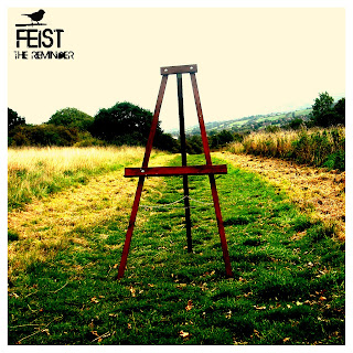
This is our completed front cover for our CD cover (ancillary task). We have chosen to use this image, as oppose to a conventional portrait of our singer, to challenge the conventions of our genre. We think that it is particularly striking which is why we have chosen it.
We used software; adobe photoshop to create it using a number of different techniques.
Change in performance scene
Our initial idea for our performance scene was to film our character miming inside a house, where she would be stood next to a window. As she gazes out of the window, the connotation is that she is looking for love, which is the 'story' behind our music video.
After taking a number of location shots and practiced filming in this location we have come across a number of problems with lighting. The light from the window varied on the time of day and it was difficult to maintain a constant, professional look to our filming. Therefore we have changed the location to our performance scene to a black studio background. We feel the light will be much easier to control and achieve the affect we are looking for.
We have taken inspiration from music videos such as 'Incomplete lullaby- Lisa Mitchell' and will use camera pans and handheld camera movements to achieve this.
Subscribe to:
Comments (Atom)

